Every Article Gets Its Own Artwork
published: 2026-09-18
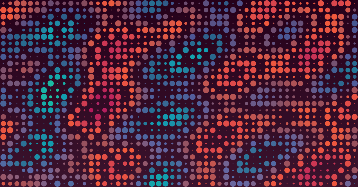
When you publish an article on kate.st, the page doesn’t get a stock photo, a clip-art icon, or a solid-colour banner. It gets artwork generated from the article’s own text. Deterministically. In about ten milliseconds, in pure Python.
Change the text and the artwork can change. Delete a paragraph and the pattern may shift. Give the generator the same article, and it is designed to produce the same image, byte for byte.
Why bother?
Most blog platforms give you two choices for cover images:
- Find or commission a photo. This takes time, can be expensive, and often results in an image that says little about the specific article.
- Skip the image entirely. This leaves the article without a visual identifier to help readers recognise and distinguish it.
Neither choice is without trade-offs, and the psychology literature helps explain why.
While researching the role of visuals in articles, we found a 2024 review by Eryn Newman and Norbert Schwarz in Current Opinion in Psychology [1]. Two findings stood out:
“Messages with images receive more attention and reach a wider audience.”
A bare post in a feed is easier to skip. Leaving out the cover image isn’t necessarily the neutral, minimal choice it appears to be; it can mean leaving distribution on the table.
“Even semantically related non-probative photos, merely inserted to attract eyeballs, can increase message acceptance through increased fluency.”
In plain terms: a picture that provides no evidence for a claim can still make that claim feel truer because it makes the message easier to process. Fluency masquerades as truth. The photo doesn’t even have to be fake—a genuine stock photo can be enough.
That second finding raised a concern for us. If an article carries the headline “Markets Surge as Growth Beats Expectations”, a photograph of a busy trading floor might make the headline feel more credible without providing any evidence for it. We didn’t want our choice of cover image to lend unsupported authority to our analysis.
We needed a third option: something intended to retain the attention benefit without presenting an image that could be mistaken for evidence. The idea we landed on was artwork derived from the article itself—not merely decorative, but a visual fingerprint of the content. No trading floors, no bulls, no worried brokers. An abstract dot field depicts no market event; it visualises properties of the text. A mirror, not a claim.
Its colours reflect the article’s estimated sentiment arc, its textures reflect the article’s letter statistics, and its visual features follow documented rules derived from the text. Documented, testable, regenerable.
A fair question: doesn’t abstract artwork also make a post feel more fluent, and therefore more credible? It might. We haven’t tested that. The distinction we’re drawing is narrower: a photograph can appear to show what happened, while Artgen’s output visualises features of the writing.
We also wanted no API charges, no reliance on external services, and no manual work per post.
The constraints
Before writing any code, we set a few hard constraints:
- Zero dependencies. The generator runs on a low-power build server: pure standard-library Python, no ML models, no external APIs, and nothing extra to install or call. That constraint shaped the design more than anything else.
- Determinism. The same title and body must produce a byte-identical SVG every time. No global random state, no wall-clock seeds.
- Speed. Time-sensitive financial analysis can’t wait on art. In practice, even a 2,000-word article renders in tens of milliseconds on our build server, so this constraint is comfortably met.
- Meaningfulness. The visual features must encode real properties of the text. You should be able to look at the artwork and get a sense of the article’s estimated sentiment.
- Scalability. A 50-word snippet and a 10,000-word essay both have to work without crashing or producing degenerate output.
How it works
Sentiment as the colour story
The article body is split into between three and nine segments, depending on its length. Each segment gets a sentiment score from a built-in lexicon of roughly 70 financial-market words with integer weights: “surge” is +3, “crash” is -3, “rally” is +2, “plunge” is -3, and so on.
The dictionary is deliberately small and finance-focused. A short list of negators—“not”, “no”, “never”, “without”, “less”, and “few”—flips the sign of the sentiment word that follows, so “not bullish” counts against the mood rather than for it.
Each segment’s score is squashed using the hyperbolic tangent function into the range [-1, +1]. The sequence of scores forms an arc: a curve mapping reading position to estimated sentiment. That arc drives the colour of every dot in the artwork.
The colour ramp has seven anchors, ordered from lowest to highest sentiment:
| Sentiment | Colour | Mood |
|---|---|---|
| -1.0 | Deep purple | Very negative |
| -0.6 | Crimson | |
| -0.2 | Orange | |
| +0.05 | Indigo | Neutral |
| +0.3 | Teal | |
| +0.65 | Green | |
| +1.0 | Yellow | Very positive |
Colours are interpolated in OKLab space, a colour model designed for perceptual uniformity. This helps transitions look smooth to the human eye and avoids some of the muddy intermediate colours that direct sRGB interpolation can produce.
Letter frequencies as the interference field
The article’s letter-frequency histogram becomes a two-dimensional wave field that drives dot size. We rank all 26 letters by frequency, take the top five, and build one sine-wave component per letter.
Each letter contributes:
- An amplitude based on its normalised frequency: how often it appears.
- A horizontal frequency derived from its rank, so the most frequent letter gets the lowest spatial frequency.
- A vertical frequency derived from its position in the alphabet.
- A phase derived from that alphabet position, offset by a seed from the title’s SHA-256 hash.
Sum the five waves and normalise the result, and you get a field, φ(u, v), across the canvas. Feed that through a sine ripple and you have dot size: where the ripple peaks, dots swell to full size; where it passes through zero, they shrink away to sparkles.
The point is that an article dominated by “e” and “t” produces a different texture from one with a different balance of letters. The interference pattern is a visual signature of the article’s textual character.
The background: one hue, lightness only
The background’s hue comes from the article’s mean sentiment, following the same ramp. Strongly negative coverage lands in purples and crimsons; positive coverage lands in greens and yellows. A subtle vertical gradient varies only in lightness, from top to bottom, never in hue.
That last part is a deliberate design rule, and one we learned the hard way. Keeping the hue fixed and varying only the lightness gives a cleaner, calmer background: a stage for the dots.
The dot grid
The artwork is a grid of dots, typically 30–54 columns wide, scaling with article length. Each dot encodes two things at once:
- Its colour reflects the sentiment arc at that reading position—the left edge is the beginning of the article, and the right edge is the end—nudged by the interference field.
- Its size comes from the ripple of the interference field at that grid location.
The two channels share one ingredient: the field nudges each dot’s sentiment value by up to ±0.5. Flatter, more even-tempered articles get the stronger nudge so their colour story doesn’t fall flat. Pattern and colour reinforce each other instead of competing.
The grid is rigid. Perfectly aligned, no jitter. We tried jittering it early on; it looked organic, but organic read as noise. A rigid grid looks deliberate, like a circuit board or a woven textile, and that’s the feel we wanted.
Small dots—those with a radius below 34% of the maximum—are drawn as four-point sparkles instead of circles. A bit of shimmer without breaking the geometric discipline.
The contrast net
Every dot needs to stand out from the background. For each dot, we check the OKLab lightness gap between the dot and the local background at that row.
If the gap drops below a threshold of 0.28 in OKLab’s lightness component, the dot’s lightness is adjusted—brightened on a dark background or darkened on a light one—while preserving its hue and chroma in OKLab space. This helps keep dots distinct from the background across different sentiment combinations.
Determinism
The system is a pure function of the title and text. No randomness, no external state. The random-looking offsets in the interference field’s wave phases come deterministically from the title’s SHA-256 hash.
Byte-for-byte reproduction across machines is the goal. No wall-clock seeds, no global random state. The output’s coarse rounding—coordinates to a tenth of a pixel and colours to 8-bit integers—also reduces sensitivity to last-digit differences between platforms’ maths libraries.
Why does this matter? Reproducibility, mostly: every cover is regenerated at build time, and git diff stays empty unless the article or generator changes. Auditability, too—anyone can take the same title and body, run the same generator, and compare the resulting SVG. No “trust me”: it’s checkable.
Caching also becomes straightforward: with a fixed generator and execution environment, unchanged inputs produce unchanged output.
Where it lives in the build
The generator is a single module containing around 500 lines of pure standard-library Python, with no external dependencies.
During the site build, each Markdown post’s title and body are passed to render(title, text), and the returned SVG string is written to covers/<slug>.svg. The SVG is referenced as a CSS background on the post card on the index page and embedded as a full-width <img> at the bottom of the article page.
For social-card previews, the build also converts each cover to a PNG using rsvg-convert, since most social platforms won’t render SVG. The og:image meta tag prefers that PNG, falling back to the SVG if the conversion fails. This conversion is a separate build step; the artwork generator itself remains dependency-free.
The module can also generate deterministic alt text from the same features: a two-sentence description of the background colour, dot density, and sentiment arc. When posts are shared to social platforms, that description travels with the image, giving screen-reader users a textual summary of its main features.
If artwork generation fails, the build skips the cover and carries on. A failed cover shouldn’t mean a failed article build.
What it looks like in practice
We tested four sample articles covering four market moods:
| Article | Sentiment arc | Background colour |
|---|---|---|
| “Markets Surge as Growth Beats Expectations” | [0.99, 0.98, 0.89, 0.80] | Dark yellow-green |
| “Recession Fears Trigger Global Selloff” | [-0.97, -0.96, -0.94, -0.96] | Dark purple |
| “Volatile Trading Amid Uncertainty Over Rates” | [0.34, 0.49, 0.33, 0.49] | Dark teal |
| “Markets Open Flat in Quiet Session” | [0.0, 0.0, 0.0, 0.0] | Dark indigo |
The colours give each piece an immediate visual identity and a rough indication of its measured sentiment—which is the whole point.
Things we got wrong at first
The background rule matters more than you’d think. Early prototypes interpolated hue across the gradient, and the results looked muddy. Switching to a lightness-only fade was the single biggest visual improvement we made.
We also initially darkened dot colours to “fit” the background. That was a mistake. Vivid dots on a dark stage looked better, and once the contrast net existed, blanket darkening was unnecessary. Keep the dots vivid; let the net handle the lightness adjustments.
Then there was the jitter experiment. Rigid won.
And OKLab is worth the implementation cost. We hand-coded the conversions between sRGB, linear RGB, and OKLab using the specified matrix constants—about 40 lines of maths. For our palette, the perceptual quality compared with direct sRGB interpolation was night and day: smoother-looking transitions and fewer muddy intermediate colours.
What’s next?
Two open threads, neither scheduled, both tempting.
The code documents an optional integration with VADER sentiment analysis, which could provide more nuanced scoring for general-purpose articles. We haven’t enabled it because the built-in lexicon is sufficient for our finance-focused content.
The covers are also static SVGs, but the interference field could be animated with <animate> or CSS keyframes, shifting the wave phases slowly for a living, breathing cover.
One file
The entire generator lives in one file: artgen.py. About 500 lines, zero dependencies, pure standard library. The implementation guide documents every constant, every formula, and every design decision.
If you want to understand how a dot got its colour or size, you can trace it back through the article’s sentiment scores, letter frequencies, title-derived seed, and the relevant formulas. Nothing is hidden behind a model or an API. It’s all right there.
Every article on kate.st gets artwork derived from its own words—not chosen, not curated, but computed. The mood of the text becomes the colour of the cover. The texture of the prose becomes the pattern of the field.
We think that’s a better kind of cover image: one that actually tells you something about what’s inside.
References
[1] Newman, E. J., & Schwarz, N. (2024). Misinformed by images: How images influence perceptions of truth and what can be done about it. Current Opinion in Psychology, 56, 101778. https://doi.org/10.1016/j.copsyc.2023.101778